
To create a new form
You need to know:
(below in order that appears in the module):
- Who will receive the form
- What the user gets in reply when sending the form both in email and on screen
- And the Form content
- And if you want to keep a Database.
How to create a form
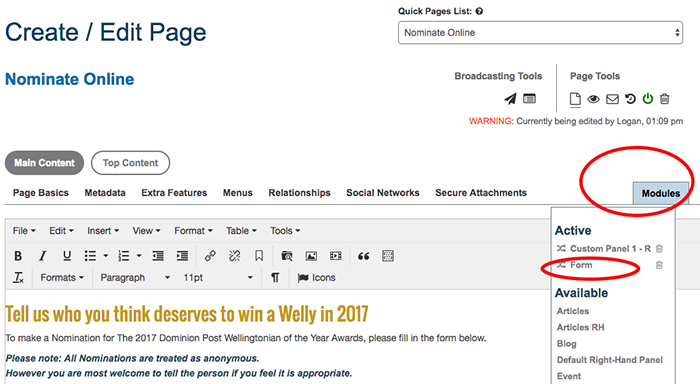
- Go to the page you want the form on.
- Go "Add-on Module" (blue button on the right)
- Go "Forms".
-
Create A Form
- Fill in the details. See Form Set up below.
Form Setup
Form Options:
Name of Form:
This name is automatically placed at the top of the form and, if left blank, will use the page name instead.
Form Button:
Text that will be displayed on the 'submit' button. By default this will be set as; "Save and Continue" unless you enter your own text here.
Disable Confirm:
Tick to disable the confirm step (which shows on screen) making the form single step save. You should also rename theForm Button from 'Save & Continue' to something like 'Save & Submit'.
Enable Captcha:
If you wish to enable reCaptcha on your form for spam protection, make sure this is ticked. This will enable reCaptcha V1 by default unless you have entered your own keys for V2.
From Email Address:
When this field is populated with a valid email address, the form will use that address to send emails from as the reply address. If no email is entered it will default to the site's email address for replies. At Flightdec we can not use the entered address to send the email due to limitations on some servers and the security policies on most accounts for limiting approved servers.
To make things simple the emails are sent as 'contact@flightdec.com' with a 'reply to' address attached.
Email Address Name:
This field can be used to set the name from which the emails are sent. This will show up in most instances in place of the email address. Usually the name of your company.
Field Note Position:
A note with information for the user regarding this field. Notes are positioned above the Forms Field Input box, if this is not ticked they will appear below (default).
Form Layout:
These options can be used to set the layout of a form. You can choose a horizontal layout, a vertical layout, or an inline layout.
The horizontal layout will place the labels to the left of the field's input box's. A vertical layout will stack the labels on top of the input fields one after the other. An inline layout will place the labels over the input box's and the input box's beside each other across the page. The default layout is set to horizontal.
Display Field Labels:
By default all field labels created for form fields will be displayed.
Tick to hide Field labels, use them for screen readers only in the inline layout .
Enable Form Limit:
Enabling a form limit will restrict how many users can fill in the form. Once the required number of users is reached, the form will be automatically turned off. This is helpful for event registrations or limiting the number of people that can make requests or purchases through the form.
Custom Limit Reached:
Use this text box to leave a message that will display when the form's entry limit has been reached. E.g, once a limit is reached a form might display the message "Entry limit reached" or "Form entries complete" The default message is set to: "Entry Limit Reached".
Payment Options
Enable Billing:
If you wish to take payments or donations you will need to tick this checkbox. This will allow you to setup your payment gateway/s and add the extra steps required of the user after they have confirmed their payment/order entry.
You will need to have an account set up with a payment service provider for this feature unless you are allowing direct credit transfer or invoicing.
Payment Express:
Payment Express is a high growth, innovative global leader in payment technology. We use PxPay 2.0, Payment Express Hosted Payment Solution. This cloud-based service enables real time payment processing without exposing the merchant to sensitive data and ensures merchants are fully PCI DSS compliant.
Once you have signed up you will be given a set of keys (PxPay Userid, PxPay Key) and a PxPay URL to enter, these must be copied into the Form setup area.
PayPal:
A global payments platform that unlike traditional platforms holds the currency in their system until the user transfers it to their own bank account. Flightdec uses PayPal's Rest API .This means you will be required to sign up to PayPal's Rest API Apps by following these instructions.
Once you have got your set of keys (ClientID, Client Secret) they must be copied into the Form setup area.
You may test your setup by using the Mode 'sandbox' and when you are ready, this should be switched to 'live'. This will change the endpoints of your processing settings within the PayPal API. This means that you can see you test account settings and transactions here.
POLi:
POLi is an online payment option that allows you to use your internet banking to securely pay for goods and services. You can sign up here, and be supplied a Merchant Code and an Authentication Code which must be copied into the Form setup area.
Direct Credit:
Another payment option is to allow your users to directly credit your bank account. Fill in the text field with your bank account details and any payment instructions.
This will bypass the online payment gateway, and if using a database, set it to 'pending DC'.
Invoice
Setting up an invoice system will automatically set the payment to processed and send out the email for payment instructions. If you are using an inventory system in Flightdec your stock numbers will be reduced by the amount in this completed form entry/purchase.
Payment Fields:
Payment Cost Field:
These are the field(s) that will be used to charge the user. These can contain one or more fields and each will be stripped of any $ amount and then added together to form a total sum.
Data:
Data fields will be used to identify this user on your payment gateway if they have these fields available. eg, data1 could be the first name and surname, data2 could be their address and data3 their phone number.
Email:
This is the email address of the user. Most payment gateways have a dedicated field for this, so we do not include it in our data fields.
Renewal or Re-billing:
You may set purchases to be on a cycle that will bill the user on a set basis. This will happen each day by an automated process that will scan the members and what settings you have selected in the form.
This will ask Payment Express to store a secure token associated to the Credit Card of the client. Flightdec will then scan daily any database entries that require re-billing and send that token to Payment Express for processing.
For renewal to work you must have a set field to test for when to bill the member again. This field would normally be read-only, and set as a 'Membership date' type.
You must also have a field that is used to define how often this member has selected to be re-billed, how much and what permissions this filed will enable. This is the 'Payment Cost Field' selected for billing during the 'Payment Fields' setup.
The name of the field will only be used for display.
The value should be a string containing values separated with ':' and should follow the rule "renew:time to add:cost:permissions to enable"
-
- The first should be if then chosen entry is a renewing one. 'renew' if yes, or 'none' or 'no' if not - "renew".
- Followed by how much time to add to the expiry when the purchase is complete. A string that can be added to 'today' - "time to add".
- The next should be the cost to charge for this transaction or 0 if not needed - "cost".
- The last will be the permissions to enable after the transaction is complete. The permissions should match what is available for your site.- "permissions to enable".
Use 'none' or 'single' for a single, non-repeat billing, but you must also specify how long to add to the expiry field.
eg:
Name = Daily, value = renew:day:10:member - would be today plus 1 day at a cost of $10 and enables the 'member' permission
Name = Monthly , value = renew:month:50:member|gold = today + 1 month at a cost of $50 and enables the 'member' and 'gold' permissions
Name = Yearly, value = renew:year:200:member|gold = today + 1 year at a cost of $200 and enables the 'member' and 'gold' permissions
Name = One off, value = none:day:40:gold = one off payment of 40, no re billing and enables the 'gold' permissions for a single day
Emails may use place holders based on your form, these will get replaced by the members details for each email notice sent.
Expiry Field
This is the field from your form that will be used to test when the entry is due to expire. It should be set as a This will activate each of the available options based on this date. This field would normally be read-only, and set as a 'Membership date' type during form set up.
Auto renewed success
During the auto renew/re-bill process the system will attempt to make a purchase. If it is successful the entry 'Expiry' field will be updated and the email will be sent. This will happen the DAY OF the expiration field.
Subject line
This is the subject used in the email that will be sent when the entry is successfully billed.
Email message
This is the email copy that will be sent when the entry is successfully billed. You may use the listed placeholder variables from your setup page.
Auto renewed failed
During the auto renew/re-bill process the system will attempt to make a purchase. If it fails the entrys 'Expiry' field will be emptied and the email will be sent. This will happen the DAY OF the expiration field.
Subject line
This is the subject used in the email that will be sent when the entry fails
Email message
This is the email copy that will be sent when the entry fails. You may use the listed placeholder variables from your setup page.
Dashboard Notifications
Enabling this will put a notification on the logged in members dashboard. You may set the timing of it and rename the buttons as required.
Dashboard Renewal Button
You may change the text on the dashboard button for the notification that a member is due for renewal. The default is 'Renew Membership'.
You may also set when to display the button. This is based on the number of weeks out from the expiry field of the logged in member.
- 4 weeks, 3 weeks, 2 weeks, or 1 week out from expiration.
Dashboard Expired Button
You may change the text on the dashboard button for the notification that a member has expired. The default is 'Membership Expired'.
You may also set when to display the button. This is based on the number of weeks after the expiry field of the logged in member.
- 4 weeks, 3 weeks, 2 weeks, or 1 week after expiration.
Email Notifications
Email notifications will be sent based on the number of days you select from the given options. The email copy may use placeholders that will be replaced by the selected entry from the database. These will be listed on your setup page and are based on the fields from your form.
Renewal Emails
This will send out an email prior to the member expiring.
Renewal Subject
This is the subject of the email used for members due to expire.
Renewal Email
This is the copy of the email that will be used for members due to expire.
Renewal notifications
Select when to email the notifications. This will be the number of days prior to expiration/renewal and you may select more than one.
- 28, 21, 14, 7, 3, 2, 1 days prior
Day of Emails
This will send out an email the day that the member is expiring. This is used for members that cannot auto-renew via the automated system.
Day of Subject
This is the subject of the email used for members expiring.
Day of Email
This is the copy of the email that will be used for members expiring.
Expired Emails
This will send out an email after the member has failed to renew.
Expired Subject
This is the subject of the email used after the member has failed to renew.
Expired Email
This is the copy of the email that will be used after the member has failed to renew.
Expired notifications
Select when to email the notifications. This will be the number of days after expiration/renewal and you may select more than one.
- 28, 21, 14, 7, 3, 2, 1 days after
Expired members
Expiring members can be modified to remove permissions after a set number of days or a grace period.
Admin Options:
Email Address:
Email address of the administrator. This will send an email to this address when the form is successfully completed.
If this field is left blank, no email will be sent.
If you wish to send it to multiple admins, separate each email address with a comma.
Send as User:
Tick to send the Administrator email as the user filling in the form
Email address of who this email should come from. If this is left blank it will come from the above email. If you enable 'Send as User' the email will come from the person filling in their email address on the form. This will require that you are only capturing a single email address.
Subject line:
The subject for the form admin email. The admin will receive it when they are sent a 'form completed' email.
It pays to use a subject line that makes it clear the email is generated by this website's form filling.
Email Message:
Once a form is completed an email can be sent to the admin email address above. The text contained in this text box will be used and it may contain a number of variables that will be replaced with the generated data from the form. To place a copy of the completed form within this message add; [-FORM-] to the confirmation message field.
[-FORM-] Will be replaced with the completed data captured on the form.
[-ENTRYID-] When saving to the database a unique ID is generated for this user. The ID is then placed in this location within your message.
[-FILES-] If you wish to attach any files that you have been asked/are required to upload to the form.
[-ATTACHMENTS-] If you wish to attach any secure files you have uploaded when setting up the form.
Logged in Member:
If the member is 'logged in' you may also use:
[-MEMBER-FIRST-NAME-], [-MEMBER-SURNAME-] and [-MEMBER-EMAIL-] to replace with their entered details.
User Options:
User Details
DB Entry Found:
A previous entry has been found, would you like to [-EDIT-]edit it[-EDIT-] or [-NEW-]create a new entry[-NEW-]?
Create a custom message for the Database Entry Found message. Use the place holders [-NEW-] and [-EDIT-] to mark the links.
E.g "You have already voted in this Poll.", "Only one entry per customer"
Disable Edit Entry:
Tick to prevent the user from editing the entry when coming back to the page, and instead allow them to create a new entry automatically.
By default a form will let the user edit their entry in the database or create a new entry when entering the page again. To disable this and allow a user to automatically start filling in a new blank entry tick this box.
Assign to Logged in member:
Tick to assign the form entry to a logged in membersID, allowing one entry in most cases.
User email
This will send an email to the email addresses from the form. A copy of the form is optional, along with your message.
To allow an email, you may either:
A) Include an email field which must be ticked to send the User Options "Email Message".
B) Make sure that only logged in users can access it. This will then user their email if the above is not set.
The "Email Message" field must also have some form of message to send.
Subject Line:
The subject on the users email. It pays to use a subject line that makes it clear the email is generated by the form filling.
Email Message:
Once a form is completed, an email can be sent to the users email address.
Place a standard thank you message. A copy of the form can be placed with: [-FORM-].
Example: Thank you for signing on to our database. Please see confirmation of your copy entered: [-FORM-]
Other options can be included in this text.
[-ENTRYID-] When saving to the database a unique ID is generated for the user. The generated ID is then placed in this location within your message when you use this code
[-FORM-] Use this code to place the form in your email.
For a signed in member you may also use [-MEMBER-FIRST-NAME-], [-MEMBER-SURNAME-] and [-MEMBER-EMAIL-] for their details.
[-FILES-] Use this code if you wish to attach any files that have been requested to the form using this.
[-ATTACHMENTS-] Use this code if you wish to attach any secure files you can upload them here when setting up the form.
Secure Attachments:
Add a File:
You can attach files to the emails here. Each file will be attached to the email if the template contains [-attachments-]. The placement is irrelevant and the attachment is not positioned inside the email.
You may add more files by clicking on the "Add Another File Field" button which will create a new select box to upload another file.
Any files uploaded are not accessible from the internet as they are stored in a secure area.
Thank You Options:
User Confirmation:
You can supply text here that will replace the user filled form once the form has been completed and confirmed. This page will display the completed form and its details as well as the 'Thank You' message below. This page will not be emailed to the user.
You can choose to supply any selected variables that will be replaced by the completed form.
[-FORM-] Will be replaced by the completed data from the form.
[-ENTRYID-] When saving to the database a unique ID is generated for the user. The ID is then placed in this location within your message.
Confirmation Divert:
When the form is completed and confirmed you may redirect to user to another page created in your Flightdec website. This page must be created first and setup as a 'Thank You page' for forms. You are given the option to select this page at the beginning of the forms module.
When using this option there is no way to use replacement variables. You may upload files directly to the page; and the page will also be secure. Any visitors landing on this page that have not completed the form will be redirected back to the Form.
If you wish to 'confirmation redirect' to redirect to a page outside of Flightdec; you may type/paste the page URL directly into this text field.
This will only be an option if no 'Thank You page' has been created inside of Flightdec.
Display Form Results:
Enable Entry Display:
Any field that has the option selected to "display this field on the results/listing page" will cause the form to list the entries found, if a database is created, on the page. You may alter some options below to change how this looks.
The following display options are:
Results per Page:
Enter the number of form results you wish to be displayed. Anything over this will automatically enable the page changer to be displayed. The default number is 25 entries displayed per page.
Display Email:
If a user is a member of your site and are logged in when they fill in the form; their memberID will be associated to the data. This can then be used to display their email address along with the captured data in the form.
You may select how you wish this to be displayed, the default setting is to not to display it.
Display Username:
If a user is a member of your site and are logged in when they fill in the form; their memberID will be associated to the data. This can then be used to display their username along with the captured data in the form.
You may select how you wish this to be displayed, the default setting is to not to display it.
Display Created Date:
The date this form entry was created and its time stamp in the database can also be printed along with the results. You can select how you wish to display this, the default is not to display it.
Form Fields:
Add more fields to a form by clicking on the blue 'Add Field' button on the bottom left.
Current Form:
Any current form fields will be displayed here. You may add more fields to a form by clicking on the 'Add Field' button.
Defined fields can be ordered by dragging the icon to the location you wish the field to be. You will need to save the form after any position modifications have been made.
Name:
The name of this form field. This will be used on the form, emails and the database to identify this particular field. This name can only contain alphanumeric characters, spaces, hyphens, underscores and brackets. eg: A_Za-z0-9-_()
Field ID:
If this data field is to be saved to the site's database you can name the save file here. If no ID is entered here the above Name attributed to the field will be used as a default.
Type:
The 'field type' drop down selection will define what type of field box is created on the form. When the data is stored in a database it will have a maximum number of characters. This is set at 255 characters by default. If the field type is a 'text expandable' it is set at 65,000 characters.
Text Field: A single line, small box used for capturing entered text.
Text Expandable (textarea): A large text box used for entering longer amounts of text. E.g paragraphs.
Email: A single line used to enter an email address. This is also checked to be a valid email address and has the option of an extra field for confirming the email address entered. This can also be enabled to send the 'User email message' to the address entered in this field.
Radio: A list of options that a user can choose from. Only one option can be selected. Options are entered by clicking "Add Option" and then entering in the value or text to the field.
Checkbox: A list of options that the user can chose from; where multiple options may be chosen. Options are entered by clicking "Add Option" and then entering in the value or text to the field.
Select drop: A list of options in a drop down box that allows the user to select a single option. The displayed name and the value of the options are can be different. You may also add headers and group the options.
Options are entered by clicking "Add Option" and entering the name to be displayed to the user and the value/text associated with it. These can be the same or different if required. Eg Wellington could be displayed as WGTN.
You may also group options by clicking 'Add Option Group'. This will allow you to name this group and add options to it. E.g, you may wish to create North and South Island groups for easier identification when selecting regions.
You may also supply a file of pre-defined options. These should one per line and set as 'Name' then 'value'. If you wish to include groups make sure to make them hyphenated or tab indented.
E.g:
Example 1, Hyphened groups:
--Advocacy Announcements
Advocacy Campaigns--advocacy campaigns
Arts Culture--arts and culture
--Complaints Protest
Compliance Rules--compliance
Crisis Warnings--crisis warnings
Example 2, Tab indented options:
Advocacy Announcements
Advocacy Campaignsadvocacy campaigns
Arts Cultureats and culture
Complaints Protest
Compliance Rulescompliance
Crisis Warningscrisis warnings
Date Picker: A date field that has a pop up date picker associated to it.
Date Picker with Time: A date field that has a pop up date picker and time picker associated to it.
Readonly: This is a 'Readonly' field. The value entered here can only be altered by the administrator of the form.
Hidden: This is a hidden field. The value entered here can only be seen by the administrator of the form.
File Upload: Allows the user to upload a file. It can be set to only allow images and can also auto resize the uploads if required. When a user uploads a file you will also be given the choice of where to save the file and if you wish to email it to the admin or user.
Header or Paragraph: This allows the form to have a header section associated to it. This will display the 'Field Name' as a header or paragraph.
Fieldset or Section Start: This creates the start of a section in the form, known as a 'Fieldset'.
When creating a Fieldset you also have the option to make this a 'required only' Fieldset. This means that it can have fields that must be filled by the user to complete this section, but other fields need not be completed if they are not relevant.
E.g, You may have created options to capture a users parents/care givers information. This would require information entered for a Mother, with first name and surname, a Father with first name and surname or a care givers information. After creating a section for Mother and Father information and a section for care giver information; you can choose to make either of these fields required, meaning that a user could fill either 'Mother and Father' information OR 'Care Giver' information to complete the section of the form.
Fieldset or Section End: This ends the section of the form.
Default:
This is the default value used for the field. This will be pre-entered into the form and the user can change it if required.
Required:
This option makes filling this field compulsory before the user can submit the form. Attempting to save the form before filling in any of these fields will result in the form alerting the user there is an error and highlighting the form fields that have to be filled.
Unique:
Ticking this field option will allow a check to be made ensuring that no other field/s have the same value entered into them by a user, effectively making the data in this field 'unique'. This is good for making sure you that only have genuine entries, perhaps on a on a petition, by making sure any email addresses entered are not duplicated for example. In this case it is also a good idea to make it a required field so that it must be entered and can be checked.
Help:
A small pop-up tool tip used to help the user fill in this field. An example of which is the icon used by the Flightdec Administration.
Field Tip:
To make filling the input field easier for the user, you may enter text here that will be displayed in the form field itself. This text is used as a 'place holder' and will be replaced by any text subsequently entered into the field by the user.
Note:
Notes will appear under the input area and can be used to add addition information to help the user fill the field.
Position:
The position of this field will be automatically selected when saving the form. By default it is in the order in which the fields are created but you can drag the field to a new location using the optional position screen or enter a new position number here.
Display Field:
If you have chosen to display the form results on a page; you can optionally chose which fields will be displayed. Ticking this option will display the field's information in the results area. You will need to let the system know how you want it displayed and also if you would like the field's name displayed along with the field's value.
If you need to alter a form:
NOTE You will lose the database if you change the form.
- If the Database is on: Export DB and Delete DB
- Turn off the 'Tick to save database' box, under DB Options at the end of the form module.
- Alter your form and make sure it is correct before you turn the Database back on.
Deleting an existing field
Under Current Form find the Name of the field you want to delete and delete the actual wording inside that field box. Or use the delete button next to the entry. Save Settings.
Thank You Page
- Create a New Page.
- Add in content and Thank you message on the page. SAVE
- Go "Add-on Module" (blue button on the right)
- Select "Forms".
- Under Form Creation/Create A Form
- Select
This will mark the page as an assignable 'Thank You' page for future completed forms. You will then be able to select it when filling in the 'Thank You' options in the forms options.
This message will not be viewable unless a user has completed the form.
Database
If you wish to save the results to a database; selecting 'Tick to save to database' will create a database saving your given form fields. Once this has been done the form will been locked to prevent further changes that may break the database. This means you cannot add more fields or rename the existing fields.
If you need to alter the form after it has been locked; you will need to uncheck 'Tick to save to database' then save the form and remove/delete the database that was created.
Create a Database:
If you wish to record your form results for later use (I.e the results from a poll or a survey) tick this box. Any results entered into this form will be recorded into the database and a table created to display the results. This can be accessed in the form of a button at the top of the page (before the shaded form field/s) to the right.
Turn the database on:
NOTE You will lose the database if you change the form.
- If your form is correct and finalised tick the 'Tick to save database' box, under DB Options at the end of the form module. If you want to alter the form do that before you tick the 'Tick to save database' box.
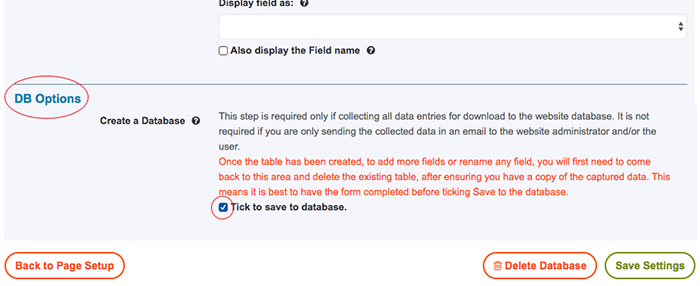

Note: The "Tick to save database" tick box at the end of the form module must previously been turned on so that export or manage the Database (DB) can take place.
- Go: Edit the page the form in on.
- On the right hand side under the Add-on Modules button, click onto Form.
- Use the 'Export DB' button to download your database.
Q&A about Exporting a Database
If you want to "export a database" in a form, does that delete the applicants or database? NO it won't delete them.
It is SAFE to export them which will create a CSV file from the database entries.
All it does is 'flag' them as exported so that you can compare them to a spreadsheet if someone is managing them externally.
Nothing is deleted and nothing is altered other than the 'exported' which will get a 1 AFTER the export.
Can you export them again? YES
Can someone else export them again? YES
To delete a form Database (DB).
- Go: Edit the page the form in on.
- On the right hand side under the Add-on Modules button, click onto Form.
- Use the 'Export DB' button to download your database.

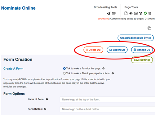
- Once you have done this you can use the red 'Delete DB' to clear the database.
Manage the Database
To change details or download uploaded files of form users.
- Go: Edit the page the form in on.
- On the right hand side under the Add-on Modules button, click onto Form.
- Use the 'Manage DB' button to alter your database.
To retrieve uploaded supporting files:
If users have uploaded supporting file to the form they can be retrieved by:
Download them individually:
- Sign into the Site admin: https://yoursite/admin
- Go: Edit the page the form in on: /page-name-the-form-is-on
- On the right hand side under the Add-on Modules button, click on: Form.
- Select the ‘Manage DB’ button.
- Scroll through and look at each entry to see if there is anything beside the Supporting Documents: field
- If there is a document: Individually select the edit icon (on the right) on that entry
- Under Supporting Documents select the the pdf, jpg or word file.
- Download it to your computer desktop.
Export supporting files in one go:
- Sign into the Site admin: https://yoursite/admin
- Go: Edit the page the form in on: /page-name-the-form-is-on
- On the right hand side under the Add-on Modules button, click on: Form.
- Select the ‘Manage DB’ button.
- It might pay to delete delete all unwanted and pre-downloaded entries.
- Select the blue button: ‘Export Files’
If the button is not available contact: admin@flightdec.com - Download it to your computer desktop.
- Go to where you downloaded the zipped file
- Unzip the file by double clicking.
- Documents should be in folders called Secure and Uploaded
MENU
Flightdec page layout
terms & measurements
Find Pages
New Page, Set Up
Alter information on an existing page
Change existing Page Name or Page URL
Pages Off and On
Reinstating a deleted page and view page history
Redirect a page
Metadata
Headings, alignment, rules and background colours
Heading levels
Size
Alignment
Buttons, background colours, rules and no spacing above or below etc
Copy content from external sources
Copy content from within the site
Linking text to pages, emails and other websites
Linking images to text, pages, and other websites
Add and link a pdf or powerpoint to download
Anchors or tags
Adding columns and other templates
Adding open/closed containers
Right Hand Side - Custom Panels
Menus
Setting up dropdown menus
Display Dropdown Menus
Menu redirect to another site
TOC
Images
FORMATTING
Pre upload
File Manager
Size of uploaded Images
Resize image on page
UPLOADING
Inserting images into text content
Change an Image
ENHANCING
Text wrap and image
Hovers
Captions under image
Borders on images
Linking Images
IMAGE FIX
Relink missing images
Remove white space under image
Download images
INDEX IMAGES
Capture an Index Image
Change an Index image
Galleries
Slideshows
Forms
Database
Columns/Templates
Open Close Containers
Videos
Audio
Add a Google Map
Your Notes
Delete cache
Source Code
Unique css page and text styles
MEMBERS Adding and Editing
Social Media share icons - AddThis
Facebook widget plugg in